A few days ago, I announced the relaunch of the new Lucky Break Consulting website, and you seem to love it as much as we do. Hooray! Thanks for the calls, texts, emails, tweets, and blog comments. Waking up to an inbox full of kudos feels great, and I appreciate the support you’ve shown the (very tired) Lucky Break creative team over the last few days. I thought it would be fun to take the new website out for a spin, for two reasons:
a) As a user of the site, I’d like to show off a few of my favorite features for you.
b) I want to share how we’ve created a memorable, branded user experience via our website because if you’re reading this, chances are good that you have a website, too. Perhaps there’s some insight that you can apply to your web presence!
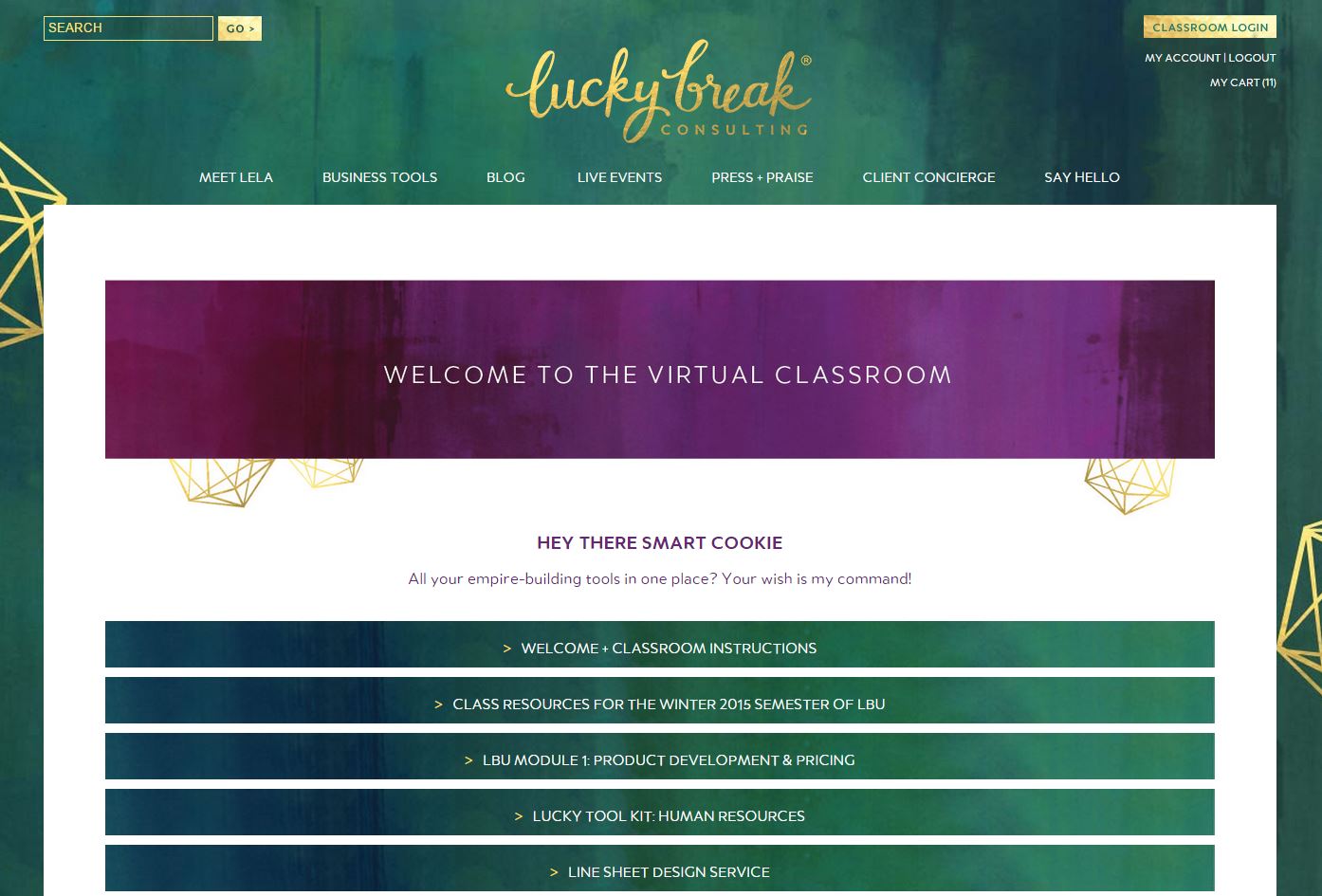
SPARKLY NEW VIRTUAL CLASSROOM
In our previous incarnation, Lucky Break Consulting hosted a special password- protected virtual classroom for students in my LBU “Secrets to Wholesale Success” program (enrollment re-opens on January 13th!). We couldn’t hide or display the content based on user category- either you had access and could see everything or you didn’t have access, and you saw nothing. Participants in our live webinar series couldn’t be added to the classroom as that content was separate, so their curriculum was delivered via email. Emails they had to track and store. The delivery of Lucky Break curriculum wasn’t especially elegant; our clients had to remember how to access all the different classes and services and my Client Concierge spent a lot of time answering questions and helping clients connect with the things they were seeking. The system wasn’t a win for anybody.
Padraic Ryan of Ryan Design Studio is my go-to web guru, and I put him on the case to develop a solution. The answer? A custom-coded virtual classroom, built from the ground up with our clients in mind. When you reserve a product or service through this website, you’re asked to create an account. Those login credentials enable you to access the new Virtual Classroom. In that new hot spot, we personalize and store all of the LBU modules, the handouts for every class on offer, the video tutorials for Price-O-Matic and every webinar playback. You only need to remember your username and password, which are the keys to the kingdom here at Lucky Break. With a couple of clicks, we can customize your classroom in real-time, dropping in new content as you join programs and request services. No more searching for stray emails… hooray!
And it’s not accidental that when you want to access curriculum, you’re not digging through your inbox- you’re visiting my site. By housing the curriculum in the Virtual Classroom, I’m constantly drawing users back to this site, where they can discover new products and services and check out our latest blog. Effective web design and strategy for the win!
MORE INTUITIVE NAVIGATION
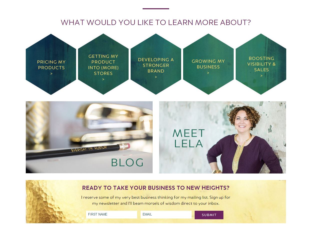
In our previous incarnation, the main navigation menu choices were TOOLS, PROGRAMS, and CLASSES. The problem? Our site users had no idea which of those they needed. You didn’t come to the Lucky Break Consulting website because you needed a program. You came because you needed to know how to effectively launch into the wholesale marketplace. Or because you were tired of undervaluing your work or were feeling insecure about your pricing structure. You weren’t lying in bed awake at night because you really, really wanted a tool. You were laying in bed mulling over how to authentically communicate your brand to your audience. The old navigation was cumbersome and far from intuitive.
For the new site, I spent time sorting my specialties into “buckets” and then making certain that I designed a solution-oriented navigation system. I literally sat on the floor of my office and wrote each of my specialties/products on a single Post-It Note.
Then I taped large pieces of paper to the walls and sorted those specialties by category. Those categories became our new navigation system. Now it’s easier and more elegant to understand how I can help build your creative brand. Solutions are quicker and easier to find, and that’s brought enormous clarity about the kind of work I do.
THE IMPORTANCE OF TELLING YOUR STORY
So many of my clients are intimidated or uncomfortable sharing their stories and it’s a subject we spend a lot of time talking about here at Lucky Break. Modern consumers are buying your WHY as much as your WHAT, but makers often feel insecure about pulling back the curtain to share the soul of their brand, but that’s where the magic lies. Your “about” page is the heart + soul of your website and a chance for you to build rabid fans that evolve into loyal relationships. The problem? Even as I was preaching the value of strategic + soulful “about” pages, I was still hiding behind mine.
Would readers think less of me if I emphasized that I’m a successful CEO and consultant… who still doesn’t have a college degree?
Would you judge me if you knew that at 26 years old, I was a single mom living in my mom’s basement with two toddlers, surviving with the help of food stamps?
Was it too much to share that my apothecary brand was once slapped with a million dollars in a trademark dispute? Would you care that I won?
Was I brave enough to admit publicly that despite international trips and a healthy bank account and splashy magazine coverage… that I found parts of running that business rather hollow and that being pushed to the edge was what sparked the idea to launch Lucky Break?
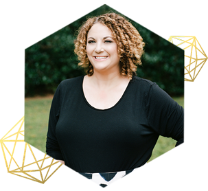
With this new site, I walk my talk. My entrepreneurial journey is shared in a more intimate, visual way… warts and all. The best part? The Meet Lela page of this website has drawn more love and attention this week than any other. My inbox runneth over with messages from makers and creatives who can relate to one facet of my journey or another. And I’m so glad that I stepped out and shared my journey, both the highlights and the lowlights.
CREATING A WEBSITE THAT INVITES CUSTOMERS TO PLAY
I can’t effectively communicate the attention to detail that was paid to every facet of this site. I wanted to infuse every nook and cranny with sparkle and warmth. I wanted you to land on the Lucky Break website, even if by happenstance, and know that you were home. To feel that you were welcomed. I wanted you to feel like you could snuggle into my couch with a cup of chai and stay a while. I dedicated myself to writing copy in my authentic voice and hiding fun, personality-filled surprises all over the new site.
The custom 404 page invites you to enjoy a spontaneous dance party. The consultation cancellation policy threatens to have me rapping Jay-Z on the call if you fail to show for our appointment. And the order confirmation screen and summary emails contain surprises that… well, you’ll just have to place and order and discover that for yourself.
I hope you love the new site as much as I do. Its construction has repeatedly reminded me of the importance of looking at everything through the lens of your customer. What do they value? What do they need? How can you solve their problems more effectively? How can you communicate with more authenticity? How can you keep them coming back for more?
What lessons have your learned about effective website design for your customers? What concepts from this blog post can you apply to your website?
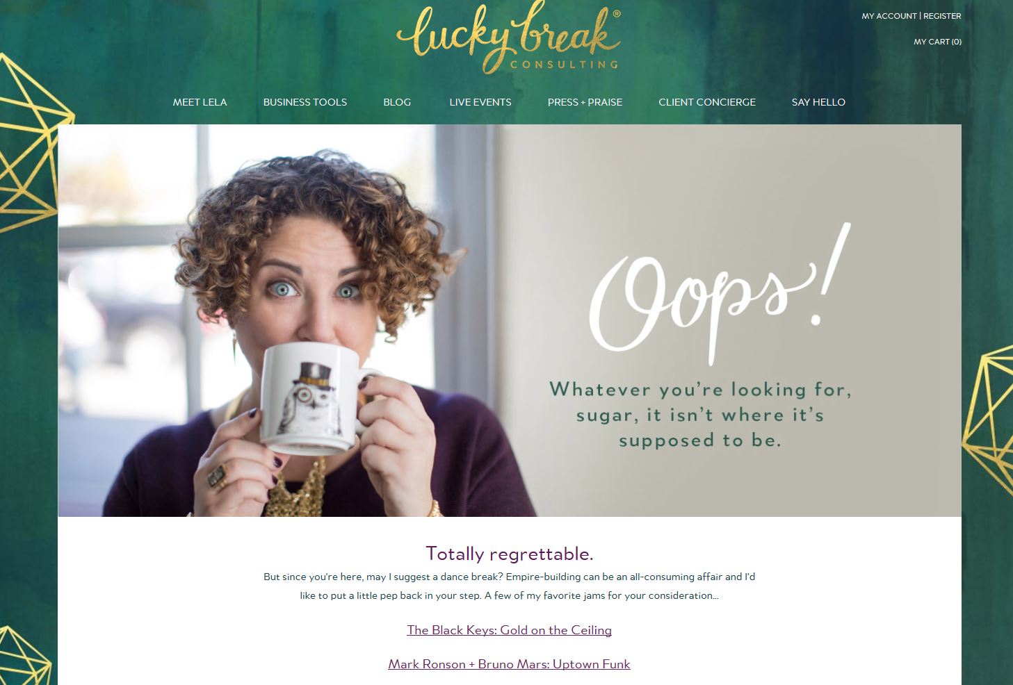


Love your 404 page! That’s one of the things we really want to customize on our site – we’re struggling with how to make it useful to customers but make sure they’re not frustrated by arriving at was is essentially a dead end.