Today marks one week since I unveiled the new Lucky Break rebrand and I have had such fun reading your emails, texts and blog comments. I’m grateful to have you cheering me on, and I’m so tickled with the results. As promised, throughout the month of January, I’m taking you on a backstage tour of the branding process. On today’s agenda: using Pinterest to curate a brand inspiration board.
Sharon, the branding genius behind Ink & Mortar, walks her clients through an interesting process of culling web images and compiling them into mood boards that serve as a compass for the branding process. She guided me through the process (okay, she dragged me kicking and screaming I don’t wanna!) and it ultimately delivered incredible clarity to the rest of the branding journey. The problem? When I say “modern” I have one vision, and my graphic designer might have another. When I say “green” which if the zillion shades am I referring to? Lime, grass, kelly, hunter, forest, olive, moss, or something else?
In eleven years of working with graphic designers, I’ve found this to be one of the trickiest parts of the relationship: ascribing language to inherently visual concepts in a way that ensures we’re all on the same page.
THE BRANDING PROCESS STARTS WITH PINTEREST
Sharon erased that worry by asking me to pin images onto a secret Pinterest board. She encouraged me to think broadly, collecting images of colors, textures, shapes, art, typography, fashion and more than resonated with what I wanted the Lucky Break Consulting brand to project or how I wanted my clients to feel when interacting with the brand. Over the course of a few days, my Operations Manager and I pinned 150+ pins and passed the baton to Sharon.
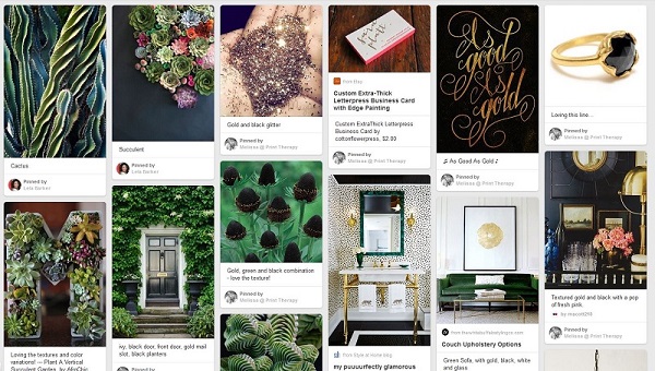
Sharon took the entirety of that pin collection and sorted them into different aesthetic personalities before presenting me with a series of inspiration boards. Each one represented another facet of what she saw reflected in the original Pinterest board. Each inspiration board was comprised of select pins and a corresponding color palette. What follows is the first round of brand inspiration boards we worked through.
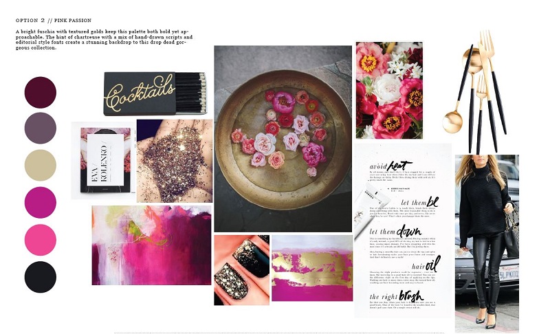
PINK PASSION: A bright fuchsia with textured golds keeps this palette bold yet approachable. The hint of chartreuse with a mix of hand-drawn scripts and editorial style fonts create a stunning backdrop to this drop dead gorgeous collection.
MOROCCAN MARKET: With handmade gold type and blues with passion, this palette is fresh, sophisticated and ready to pop off the page. Nature-inspired textures ground the palette and showcase the delicate type perfectly.
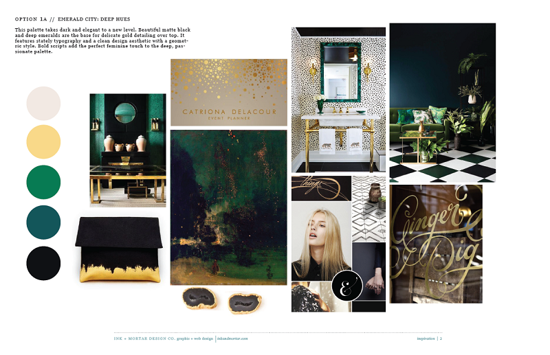
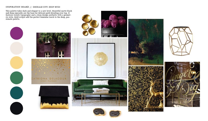
 EMERALD CITY: This palette takes dark and elegant to a new level. Beautiful matte black and deep emeralds are the base for delicate gold detailing over top. It features stately typography and a clean design aesthetic with geometric style. Bold scripts add the perfect feminine touch to the deep, passionate palette.
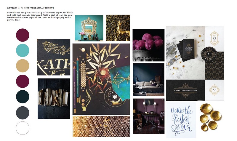
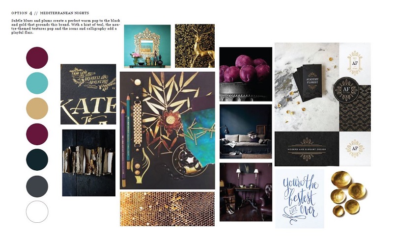
MEDITERRANEAN NIGHTS: Subtle blues and plums create a perfect warm pop to the black and gold that grounds this brand. With a hint of teal, the nature-themed textures pop and the icons and calligraphy add a playful flair.
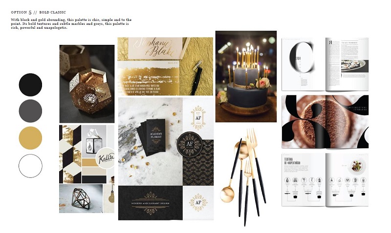 BOLD CLASSIC: With black and gold abounding, this palette is chic, simple and to the point. It’s bold textures and subtle marbles and greys, this palette is rich, powerful and unapologetic.
From those five boards, I narrowed it down to two that I wanted to explore: Mediterranean Nights and Emerald City. The plum of the Mediterranean board called to me and I adored the honeycomb, the hammered brass plates, and handlettered font. I was less enthusiastic about the teal, and was worried about trending too dark. I was crushing hard on the geometric side table from the Emerald board, and I was drawn to the rich green and gold foil details. I asked Sharon to reshuffle the boards, keeping the pieces that I was smitten with while throwing the rest back. Though I’m still hell-bent on tracking down the (now discontinued) black + gold flatware from Diane Von Furstenberg seen in a couple of those boards!
REFINING + RESHUFFLING FOR ROUND TWO
Sharon circled back a couple of days later with two new boards, which were remixes of the original incarnations.
EMERALD CITY: This palette takes dark and elegant to a whole new level. Beautiful matte black and deep emeralds are the base for the delicate gold detailing over top. It features stately typography and a clean design aesthetic with a geometric style. Bold scripts add the perfect feminine touch to he deep, passionate palette.
Swoon, right? I had stumbled upon a gorgeous, handlettered script from a British butcher shop that I fell head-over-heels for and I asked Sharon to bring that into the boards (it’s the script in the bottom right corner of the above image). I wasn’t as wild about the green wall (too much blue in that hue). I also wasn’t sold on the blonde chick and patterned floor tiles. In that same round was board number two…
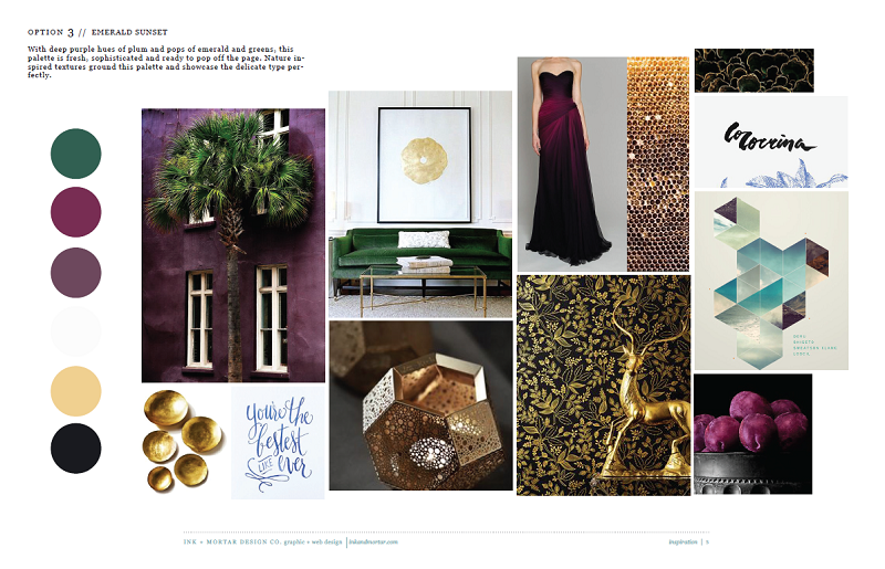
EMERALD SUNSET: With deep purple hues of plum and pops of emerald greens, this palette is fresh, sophisticated and ready to pop off the page. Nature-inspired textures ground this palette and showcase the delicate type perfectly.
Be still my beating heart. That gown? I can’t even. High-fives for honeycomb. The living room vignette makes me a bit weak in the knees- I loved how bold, modern and clean it was. Less successful: that dusty mauve/plum wasn’t working for me and the brush text felt a bit too informal. And that geometric? Intriguing, but it didn’t have the same sway as that brass geometric side table I’d already fallen for. I asked Sharon for one more shuffle…
Ladies + gentleman, we have a winner! I was so twitterpated after seeing this board drift into my inbox late in the evening that I struggled to sleep that night. I love the plum, emerald, and navy. Hells yes to my living room vignette and the brass geometric table. I appreciated the way the gorgeous handlettered script, the organic texture of the hammered bowls, the brushstrokes on the clutch, and that abstract painting reflected the artisan nature of the brands I work with.The inspiration board felt modern and rich, clean and powerful, artistic and elegant… that is precisely what I was aiming for.
Mark my words: that drop-dead-gorgeous black + gold wallpaper from Rifle Paper Co. will find its way into my house one way or another.
THE POWER OF AN INSPIRATION BOARD
This final inspiration board served as an anchor that we returned to time + time again during the design process. This was the clearest distillation of my brand vision and it gave us a visual language to reference as we fleshed out the skeleton of the new brand. I’m convinced that it made the entire branding process smoother and more efficient, keeping costs in check and bringing clarity to the journey.
Putting this process to work for you:
1. Pin images that attract you to a secret Pinterest board. Don’t discriminate on this first round- pin everything that catches your eye.
2. Do a second sweep of the pins, editing images which don’t fully resonate. On this second pass, begin to think about how the images/ colors/ fonts make you feel and identify images that elicit the emotional response of the customers you’re seeking to work alongside.
3. Sort those pins into a series of inspiration boards. Begin building out color palettes and match the imagery with coordinating fonts and typography.
4. Work back through each initial inspiration board, fine tuning the vision as you go.
5. Once you lock onto a final board, print it + pin it near your workspace as you move through the rest of the design process. That’s your anchor!
I hope this post proved helpful, as the process of building inspiration boards was a tremendous eye-opener for me. Stay tuned: next up on the rebranding journey, I’ll walk you through more than a dozen logo concepts developed by Sharon for Lucky Break!
Have you built an inspiration or mood board for your brand? What process did you use? How did it prove helpful during your branding process? Drop a comment below… I’d love to hear about it.
Thank you Lela and crew for the tour through your lovely mansion of texture and color. A private label client sent me a secret board a year ago to help with her rebrand. I started pinning to my own soon after. You know I am working on a rebrand. This post dropped in my inbox today and jump-started my creativity. Your transparency, humor and elegant vision inspires again!!!
Sorry, I’m confused – what do these boards have to do with your brand? They’re pretty – they are clearly things you are interested in, but how is it “branding”? did you mean the board gave you the inspiration for your website design? I just don’t understand…
Hi Laura,
The process of creating mood boards via Pinterest allows client + designer to get on the same page. It creates a visual vocabulary from which you can both draw as you move through the process of creating a visual identity. These mood boards were a way to pair down and refine my interests and the final inspiration board encapsulates the colors, shapes, textures of the final brand while personifying how I want my customers to *feel* when they see my visual brand. It’s a really, really important step in the branding process. I hope that clarifies!
I make these using polyvore for outfit planning and inspiration 🙂 All my moods are tied to my clothing choices so I think subconsciously I am doing the same thing with creating outfit boards that you are doing with interior design boards.