This blog is part of an ongoing peek inside the process of rebranding Lucky Break Consulting. You’re invited to catch part 1, which explores how I learned to really listen to my customers and develop a website built especially for them. Part 2 details how to use Pinterest to create brand mood and inspiration boards.
Of all the things I love about my rebrand, I think I’m most smitten with the graphic elements: the emerald green watercolor wash, the shiny gold geometric shape and the handlettered logo. Three fantastically simple elements, right? Um, no. The divine Sharon of Ink & Mortar breathed life into these beauties but she was deep in gestation with them for many, many rounds of revisions. I thought it might be fun to explore the journey of birthing our new logo design, from concept to final design. Keep our final inspiration board in mind as you read the rest of this blog, as it’s the anchor for the rebrand.
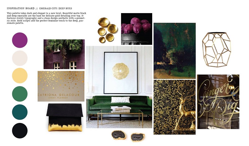
I made myself focus on 5 adjectives that I wanted to really represent the new brand: confident, elegant, handmade, modern, and opulent. That’s a process I walk my LBU Live students through: selecting five specific brand attributes and then keeping them front + center throughout the process of developing a brand identity.
Round 1 of the logo sketches included 11 rough iterations, which was an incredibly generous offering. Most designers I’ve worked with in the past had offered 3 rough sketches which would be narrowed down to 1 preferred design that would then undergo 2-3 rounds of revisions. Sharon started very broadly and gave me lots of options upon which to meditate. The idea behind round 1 of a logo sketch is simply to choose the direction you’ll pursue. Here are a few of my Round 1 favorites…
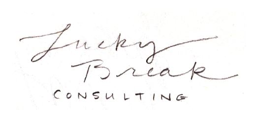
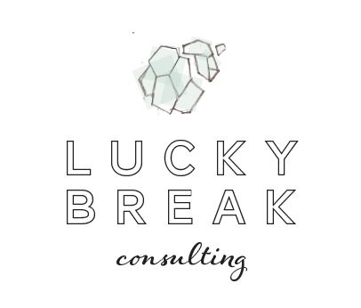
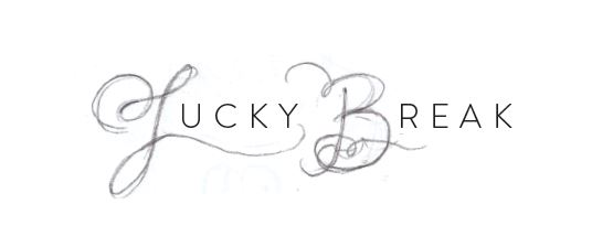
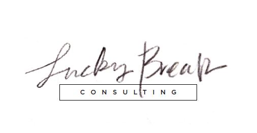
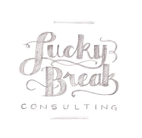
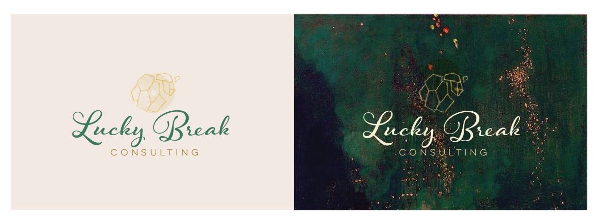
Of those concepts, the number with the meteroid-esque shape and the version with the word “consulting” in a box stood out for me. I reverted back to Sharon, who then pushed the designs further, layering them with colors from palette we designed on the inspiration board, along with other textural elements. Here’s a peek at round 2…
![R2B]](https://www.luckybreakconsulting.com/blog/wp-content/uploads/2015/01/R2B.jpg)
You might remember that green/ black/ gold painting from the original inspiration board. I couldn’t well use someone else’s art without permission and the artist is unknown to me, but this internal mockup served as a great foundation that enabled me to see how these logos might look on a similar, custom background that Sharon would ultimately create. I wasn’t feeling the Hummingbird font (that’s the fanciful modern script up top), but I was totally crushing on the handlettering and the idea of the painting. On to round 3!
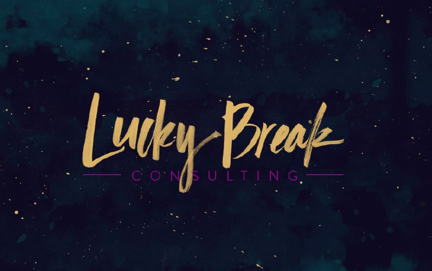
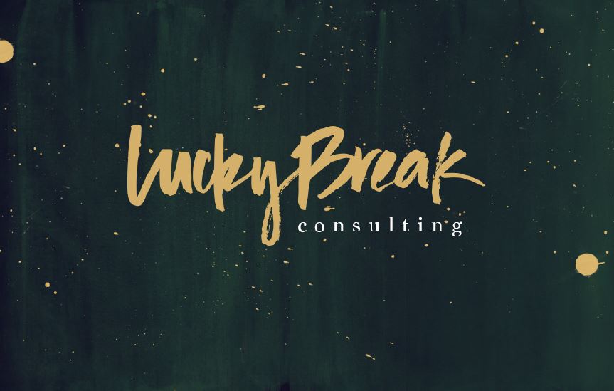
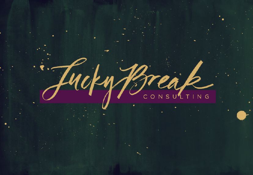
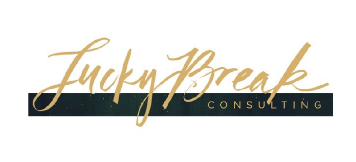
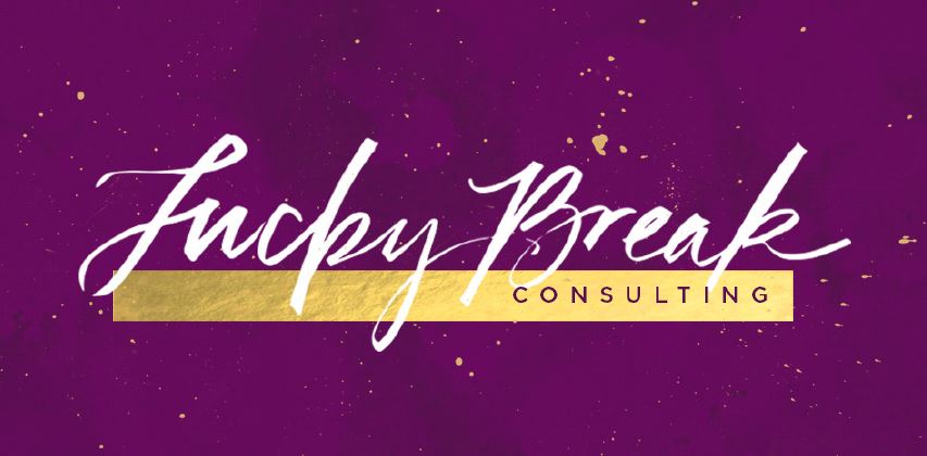
Mercy! Do you feel how hard Sharon is working? I love the watercolor idea but some of this felt a little galaxy-esque and that’s not what I was aiming for. And perhaps it’s all the CSI my kids watch, but the splattering reminded me of crime scene forensics. No. Thank. You.
On the lettering front, the brushstroke logos up top felt a bit too casual. And I asked Sharon to bring in some gold geometric action from the original inspiration board. Back to the drawing board. Thank heavens that Sharon has the patience of a saint! Here’s what round 4 of the logo sketches looked like…
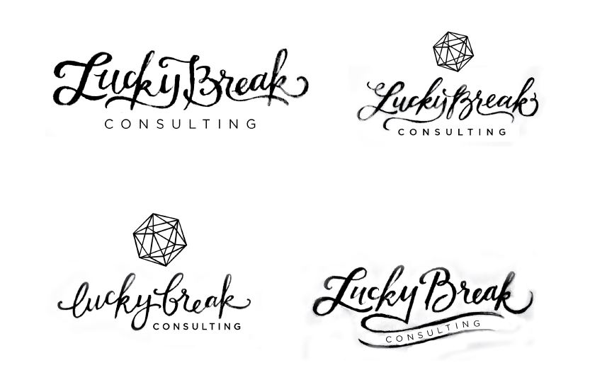
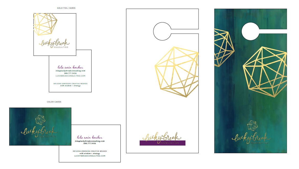
THREE CHEERS FOR HUGE LEAPS FORWARD! In this round, I felt like we were really connecting with the heart + soul of Lucky Break. This was starting to feel confident, elegant, handmade, modern, and opulent. Sharon created a custom watercolor that was more emerald, less olive. No blood splatter patterns here. And that gold geometric? Swoon. I’ll take it. Sharon knew we were close, so she started building out collateral material: business cards and doorhangers that we give away at live events where I speak. I asked Sharon to push deeper into the logos on the upper right and bottom deft, dialing back the curly-q’s a bit.
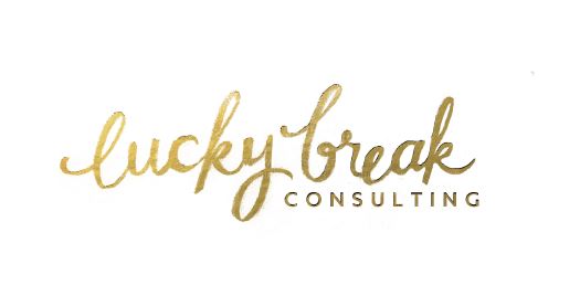
BAM. Be still my beating heart…. I’m in love! All this needed was a bit of polish and my new logo would be ready for its closeup. I asked Sharon to lessen the “dip” between the L and the U, give the L a tad more height and ensure that the B read as a B and not an F. Because “lucky freak” sounds like an entirely different sort of business. Ya dig?
Good logos don’t come quick, cheap or easy. All totaled, Sharon went through 33 (!) logo revisions across more than a dozen concepts before calling it a day. Bless her.
TIPS FOR EFFECTIVE LOGO DESIGN
1. ENSURE THAT YOUR LOGO WILL SCALE.
If you were to blow it up on a billboard, how would it look? Could you shrink it down to fit on a lip balm? Always consider the final application in mind during the design process and leave yourself some flexibility. You currently make lotion and soap but not lip balm? Don’t ignore the need for a logo that reads well when it scales down teeny tiny or you’ll lock yourself out of potential product development opportunities: product samples, lip balms, aromatherapy inhalers, etc.
2. YOU’LL NEED A VERSION THAT READS WELL IN BLACK + WHITE.
Color printing is typically expensive, but not always necessary. If your logo won’t read well in black + white, then you’ve forced yourself to pay for premium printing even when it’s not necessary. Save some dollars be ensuring that your logo is flexible.
3. AVOID LOGOS THAT ARE OVERLY DEPENDENT ON GRAPHICS.
Lucky Break’s previous logo featured a mondo-sized fortune cookie. The size of the logo meant it was hard to incorporate into certain applications. Sure, I could remove the fortune cookie and use the text-only version, but I hadn’t given much thought to the text-only version during the design process. It wasn’t particularly distinct, and it didn’t represent my brand well. For the rebrand, I knew I want a text-based logo that would ensure more flexibility.
While there’s nothing inherently wrong with graphic logos, make certain that you have a text-based version that retains the brand personality in the absence of the graphic piece.
4. BE PREPARED TO GIVE YOUR DESIGNER SPECIFIC, NUANCED FEEDBACK.
They’re not inside our heads and “I don’t know… I just don’t like it” doesn’t help a designer hone in on what you need, no matter how good they are. Can you score the internet to find a font you like better? Is it the way the way that the tail on “K” kicks up- would you prefer it to point up rather than down? Being as specific as possible will move you forward faster and keep the project in budget.
Want my short list of recommendations for graphic designers that’ll make your brand sing? Download my Big Book of Branding Resources and meet some of my favorites.
In the next blog, I’ll show you how we pulled together all of the visual identity elements of this brand using a Brand Style Guide. More soon!
I’d love to hear about your logo creations process. Pop a comment below and let me know about the birth of your brand identity.
I’m so glad you decided to be Lucky Break instead of Lucky Freak 😉 There are some great tips here that we didn’t manage to take advantage of when we did our (very minor) rethinking of our logo. There may be some further work to do there for us!
As an ex and recovering logo designer….this timeline blew me away. Buy that girl a drink! (I’m sure you did more than that). Thanks for sharing….I just put my company design attempts across the coffee table for a friendly critique. What a relief when my pal picked the one that best reflects my soul. My logo reflects my soul, the branding comes next. Thanks again for generously sharing your process Lela. Blows the cob-webs off every time.